Sunday, September 27, 2020

Cascadia's diorama paraphenalia arrives with some brand new stamps!


Cascadia must be my most communicative mail art correspondent. so I few things to post from him. the first is this postcard, He is at work on his diorama.  I have to say, Cascadia's imagination is better than the Senate's. I am heartened to see that progress is being made somewhere, though!  I can't see if the workers are wearing masks but I hope there is social distancing :)


This next postcard is a larger format which is great.  It's easier to see Debra Mulnick's Postal Plaza Display which is centre stage at the Post Office diorama!

I love Cascadia's identity stamps! He tells me he will be working on the next series of yicket stamps in mid-to lsate September but he has a niggly hip so everything may be delayed.  Poor Cascadia!


You will see that I got some pristine Walmarth stamps and some extra ticket stamps! Whoop whoop!


My 'double clutch' arrived between scanning and posting these so in a little while I will share that with you.  I guess the orthopaedic surgeon didn't win.

Thanks so much, as always.


Sunday, September 20, 2020

Meet my 'Webby Rabbitholing' New Friend


I'm not sure if I am meant to read the words below the drawing on this envelope.  As it happened, the mail graffiti has printed over the words making them impossible to read now. I suspect it is asemic writing and part of Ted's poetry. The image is also enigmatic but, enticing! I haven't met Ted Trager before.  I notice the restrained colours and appreciate the typewriting. When I turn the envelope over I learn how Ted found me:

I am well, Ted.  I am a little slow responding to mail art these days, and even slower sending it out but I appreciate every piece I get and archive them all in my big mail art collection.  I record all my incoming and outgoing mail in my postal ledger and eventually reply to everyone.

I don't know enough baout ted to put these images in context but notice that each of the four quadrants works as a strong image on its own. It reads as an album cover. Punky Jazz, maybe? The red suggests protest to me and the horn must be playing something sad.

On the back, I find another visual poem. Like making marks with charcoal, I see rhythms of lights and darks and notice the ls, os and js, stroking the white paper. 

I can almost see the character of the person who wrote this. Some day, when I have time to settle down in my armchair, I will try to unpick the exact words in this example from the POG archive for now, I will just delight in the exclamation marks.


Thank you Ted.  


Tuesday, September 15, 2020

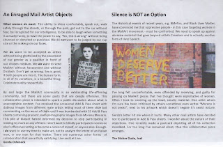
Enraged and with voice

Joel makes mail art with a message. He collaborates with a number of other artists and is fastidious about crediting them.  He is a thoughtful, enthusiastic correspondent. He is generous in nature and unwilling to stay silent in the face of injustice or 'bad politics'. 

I have said before that Joel cajoles and juxtaposes humor with his message. This is evident from receipt of Joel's envelope. ' The social responsibility of the artist is to survive and nibble away at societu's thick hide with love and sharp teeth. - Harley'. show the heroes: Harriet Tubman, sitting Bull… paddle through the rising sea levels hold women in high esteem, covid skeletons with no sense of what we are living through- Hope and doom, side by side.


In England we aren't singing.  They think singing spreads Covid 19. But if you were really keen, you could laminate Joel's song and put it in the shower to sing there.  It is a bit of a sad sing, though.  But it is a sad time. 

My nephew is heading back to Eugene Oregon in a few days and this aunt is worried for him. We lived through the 'haze' in Singapore from the burning forests in Kalimantan.  It is awful and there were no protests, no police shootings, no pandemic. 

The first time I heard this was on The Last Word (Lawrence O'Donnell) then I read it in the New York Times. It is the sort of writing we all need to read again and again. And then, do some thing to address it.
YUM!


√√ √ I agree.

I loved the tone of the enraged mail artist.  Her conviction is apparent and she is never strident.  Although, strident would be fine. It is shocking when a correspondent isn't empathic. The majority of my correspondents have been thoughtful and empathic, fortunately. When I have receieved mail art that feels inappropriate I have kept it and filed it but I have not enjoyed it. I have edited out pieces that miss the target audience in a mail art exhibition. I appreciate Joel's 'need' to halt the practice of sharing imagery that is not thoughtful, empathic and appropriate and may go to my file and return it to the sender. 

Monday, September 7, 2020

Amagamated confusion and rings of fire

The Ant Hunter

I got these postcards from Amagamated Confusion a little while ago. Who knew lockdown and unlocking could be so busy? When I look at the date, this was mailed on the 31st of July. The first wave of lightening strike fires had occurred but I suspect interpreting this in that light may be me conflating things retrospectively. Still, it creates a powerful metaphor, of accidental ramifications and the powerless we have in the face of mother nature. And then there is the simple aesthetic nature of the striking image! Little boys and magnifying glasses are a rite of passage.BEWARE!


I have included the backs of these cards so you can compare! I love the slick way Amalgamated Confusion makes his postcards, great graphics and so subtle!


Our Forest Home
This doomsday scenario may have been foreshadowing. Even a 07/08 postcard is a little premature for the ravages of the current fires.  Stay safe.  It is a fraught period! I can't tell if he's got a mask on but I love the juxtaposition of the smily face and the doom.  Those ghosts in the smoke at the window are ghoulish, hanging there POOOF.  I believe the ripped areas of both postcards are intentional, beautiful marks to enhance the composition and feel. Thanks AC.


Toni Hanner Postcard Swap 4.0: Toni Hanner


1304 Splotches from Toni Hanner (IUOMA) Toni at IUOMA is ink (I think) on photo paper with a rectangle of turquoise collage. It feels as if the splodges are taking wing and leaving the postage stamp building to stay anchored. The overlap of colour is one of those things that fascinates me and Toni's splodges are both distinct and splodgy.  Enough said.  It just works. Great stuff!  Thank you.


Hanner Postcard Swap 4.0: Terry


Whoop, whoop, another postcard for the Hanner Postcard Swap! This time from Terry Owenby. I love the translucent quality of the background with the gorgeous pastel hues.  Old stamps and french text as well as the inking, or painting over create a unique and celestial feel.  I feel as if I am among the clouds and it's all good news I read in them. Thank you. On the flip side Terry stamps ' happy day to you' , POSTCARD and a bit of NYC washi tape acts as a dividing line.  what a fun postcard, the circular flower forever stamp is perfect too.