Friday, November 4, 2016

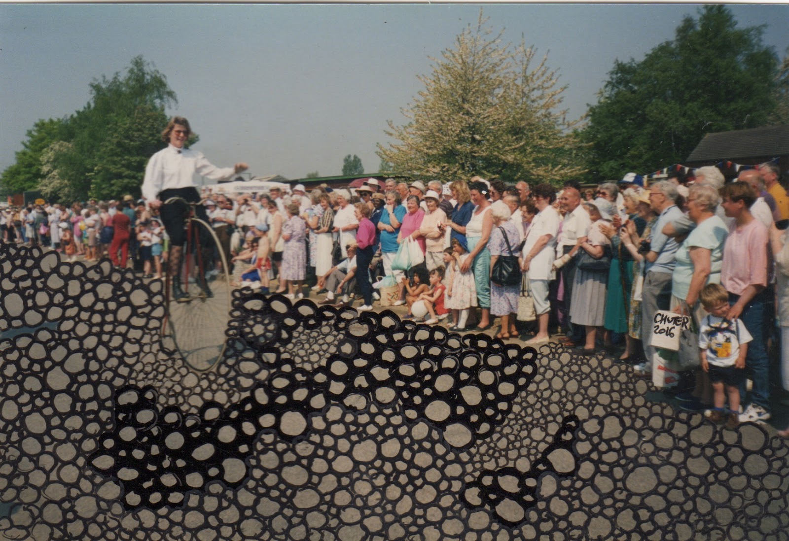
England erodes while Robin Chuters draws.


Whoop whoop, I received mail from a new (to me) mail artist / artist! The postmark is 3rd of October, so Robin chuter probably thinks I am an terribly ungrateful recipient.  I am not.

When I opened this envelope, the first thing that went through my mind was that someone was sending us some family photos from the past. Patrick's family sold penny farthings and the woman on the penny farthing looks like my mother-in-law (well what she looked like some time ago). and the house has the feel of the family home in Stratford-upon-Avon.  On closer inspection, I realised that these were altered photos, meticulously altered original photos in pen and ink and it was just serendipity that Robin sent them to me.  She seems to be cycling on something of a yellow brick road.  It's magic!


Visit Robin's website to see more of his work: http://www.robinchuter.uk

The missing pictures… More from Herman

I'm back to my blogging pile and lo and behold, I see this 'packet' of pictures, a folded larger image and other smaller things.  All neat and tidy, with a recogniseable Herman Kamphuis feel about them.  I'm not sure what happened, but these collage materials are wonderful and appreciated.  I can't quite see how I missed them!


 I know Herman is a fan of Hannah Hoch.  Her show at Whitechapel a few years ago was an eye-opener for me! At the moment, I am interested in juxtaposing some of these vintage characters (like the ones above) with my fused plastic landscapes. Yesterday I was inspired by Meredith Monk http://meredithmonk.org and Herman…

The words were in a package from Diane Keys. I'm not sure who this going to yet. It is CD (ish) size.

Wednesday, November 2, 2016

Herman conjures sunny days and patiently waits

Herman's strong whimsy is a delight! He and I share the love of contortionist bodies made with a line or two. I have had Herman's mail art sitting by my computer for weeks.  It arrived when I was in Maine and I vowed that I wasn't going to get sucked into opening and blogging my small pile of mail art in a short space of time.  I have had a few shows to make work for and it feels important not to let mail art ever feel like a burden.  It is a joy and an exchange, but I regret when I can't manage to acknowledge work in good time, so sorry Herman.  You are a loved and faithful correspondent.

Earlier in the day, before opening this, (I have got into the habit of opening and blogging in the hour + between dinner and  my frivalous hour of the day, when we watch an episode of a box set) I made a few pieces of mail art! One ended up being for Herman, but on receiving this, it feels woefully inadequate. Hey ho.  I trust he understands.  I know he understands!  Inside this mailing Herman wrote me at letter! In it, one of the things he told me was how busy he is too. What a treat when a mail art correspondence is both bewitchingly, haptically beautiful, poignantly funny and communicates as well!

The bespoke CD-sized envelope is the container for the drawing above and fitted into the envelope below.
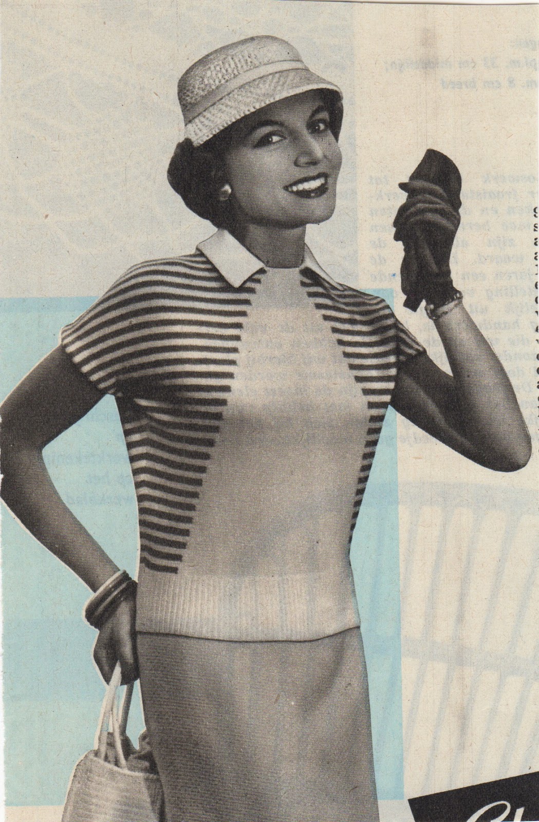
Sweet that Herman has named Grace Kelly look-alike Rebecca! I used to wear lipstick like that, but even with silver hair will always be a brunette!


Thursday, October 27, 2016

A lesson in scraps - NBS

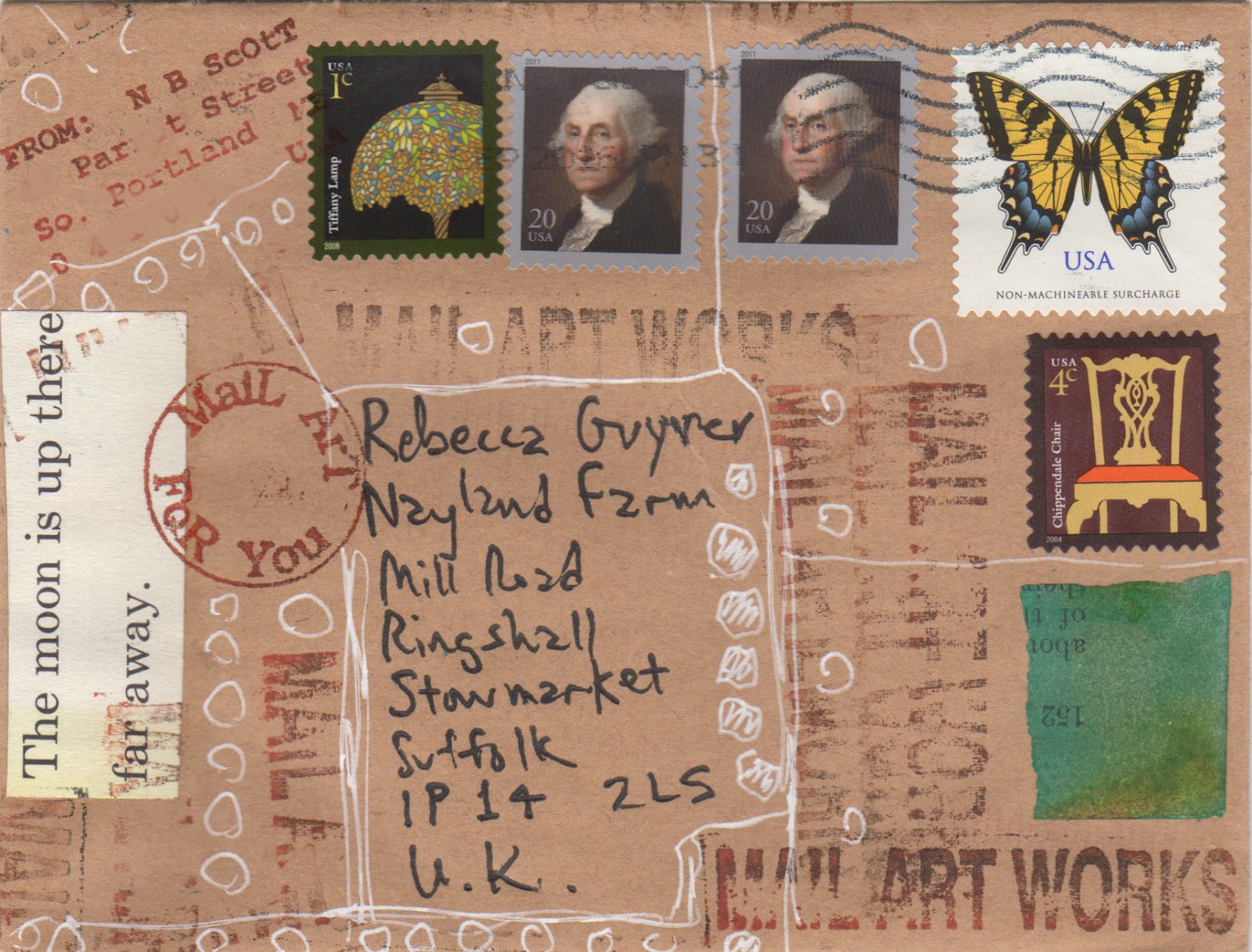
When I get an envelope like this, I get goosebumps.  I was so happy to hear from Nancy Bell Scott that I messaged her at IUOMA. Mail from Nancy is always a lesson, not a didactic lesson, a subtle you shouldn't be trying so hard, natural is better, stop TRYING SO HARD. She makes beauty feel effortless.  She helps me to see the mundane differently.  She is just unique.
This arrived folded , like a palm sized card


I have stuff all over the place in my studio and I couldn't help but arrange nancy's scraps and card in a little still life.
I see the sky.

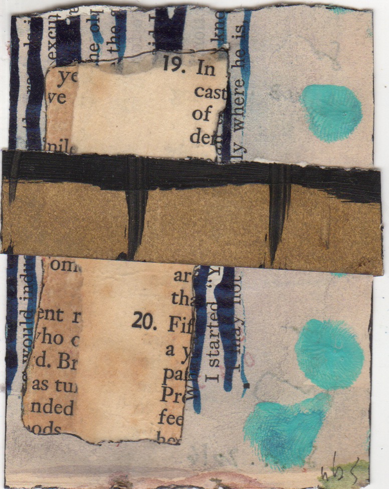
One of two three-scraps

two of two three-scraps


backs

As ever text and colour, line and form combine to make jewels to marvel at.

Wednesday, October 26, 2016

Aristide 3108, Tiziana, the lions, friends and me.

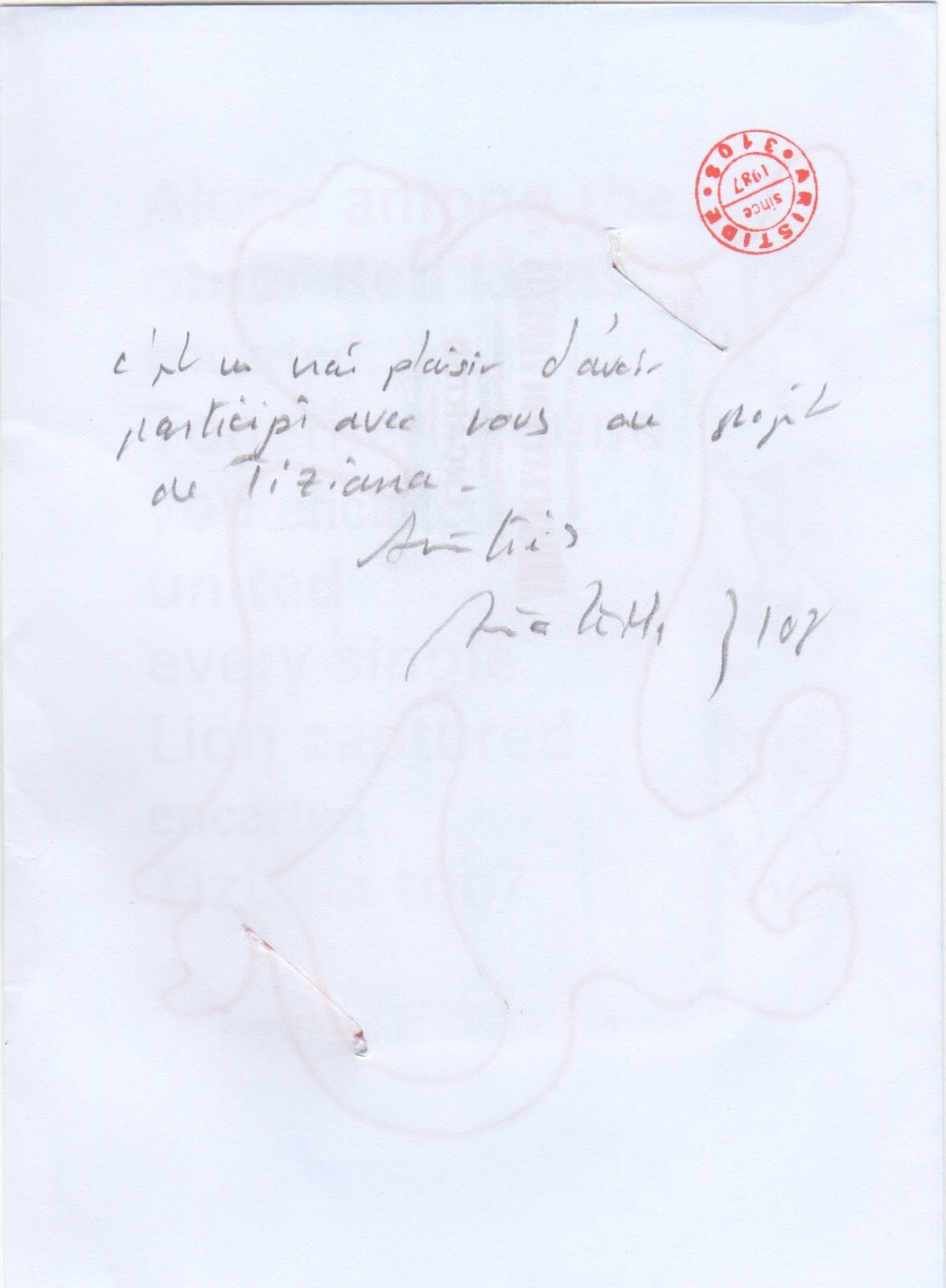
So excited to receive an encarted from Aristide 3108. Joel Cohen helped me to make a mind map of mailartists who I exchange with, visualing it that way was great.   Aristide 3108 finds connections and makes them explicit here.  

This encarted comes from a project mastermined by Tiziana.  We all contributed red lions.   You can see them here:

Aristide's poetic and minimalist touch is glorious.


Meet me at Dan Lynch or La Jolla

 Our daughter joined a choir again.  I think it's a Greek choir in Glasgow. Our son doesn't have time this year; his schedule, as a junior doctor, is unpredictable.  Although I don't play any instruments and don't belong to a choir, the practice of music is something I esteem, and that esteem seems to have translated to our children.  What I'm trying to say is that if I were near Jude Weirmeir, I'm sure someone in our family would be high-tailing it to the corner of La Jolla Village Drive and Genesse to Learn the Blues. Would they be singing or playing them?

I love that concept, learning the blues, can you REALLY teach that? I thought the blues was embodied. 

When I lived in NYC I used to go to a place called Dan Lynch to listen to the blues. I understand it has closed.  That makes me sad.  I used to get right up close, shoes filling with sawdust. I also adore the puns on this mailing: the cow horns and 'meet'; 'fame and fortune guaranteed, the antithesis of singing the blues, And also the fab aesthetic above and below.
I am reminded that if I don't get my skates on and send some mail art to Jude, he will give up on me!
Huge thanks as ever.  My excuse this time is I am obsessed my Donna Tart's The Goldfinch.

Wednesday, October 19, 2016

Question, Exclamation, Eyes on Art - Dave the Rave


This altered postcard arrived from Dave the Rave a few weeks ago. On the back are some punctuation marks: question marks, exclamation marks, quotes and commas. To my mind, the punctuation symbolises the audience and as dave commented in a FB post in response to another eye-laden piece he had sent to TOFU, "So many eyes look at art , it seems only right for the object to become the subject." I like the joy, the fun, the haptic quality and the the colour!  Many thanks, Mr Rave.